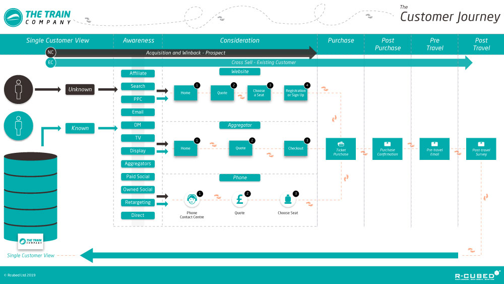
At R-cubed, we like to think we know a thing or two about customer journeys. We’ve helped dozens of businesses build effective journeys that ensure a powerful, relevant and profitable customer experience is delivered at every stage, and at every touchpoint.
It means our radar is always twitching when we come across a useful example of a Customer Journey in action, be it the good, the bad or the downright ugly.
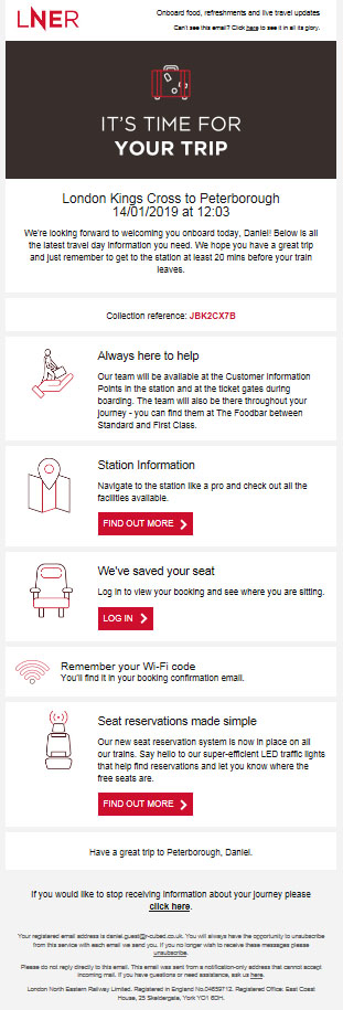
When one of our team booked a train trip to Peterborough, they got more than they bargained for and were quick to jot down their observations. In this article, we see some great examples from LNER who are clearly trying to deliver a First Class customer journey….
All aboard…
Someone, somewhere has given a lot of thought to the communications you receive when you buy a train ticket from London to Peterborough. Which is rather surprising, given that buying a train ticket for a 40-minute trip to a business meeting isn’t normally the sort of thing to get to excited about. You pay your money, you get a ticket, thank you very much, goodbye.
But I was pleasantly surprised to see than LNER had gone out of their way to make it a much better experience than I had expected.
It’s worth pointing out that LNER is a government-owned operator which took over the East Coast rail line after Virgin Trains East Coast ceased operating on 23 June 2018. So it may be that they have reskinned some of the existing Virgin Trains marketing work, but either way, they are to be congratulated for producing a well thought-out programme that could teach many larger organisations a thing or two about customer journey communications.
At R-cubed, we’re keen to highlight best practice, so let’s have a look at some of the components of LNER’s customer journey.
Awareness
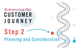
I already knew where I wanted to travel and I was redirected to the LNER site from National Rail, so I can’t comment on the effectiveness of any marketing that LNER do in terms of raising awareness.
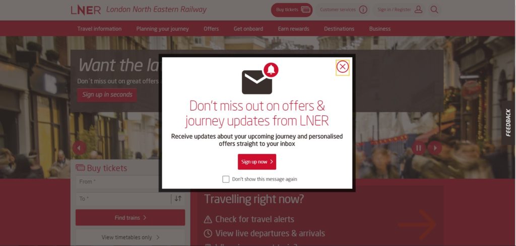
However, the landing page is sleek and attractive, and the opportunity to sign up for offers and updates looks great. It’s not text-heavy and it’s easy to close and dismiss forever if you aren’t interested.
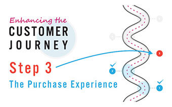
Purchase
The carousel at the top of the page is populated not just with functional messaging but some inspiration too. There are two easy ways of starting your booking journey, although the ‘Buy Tickets’ button at the top could do with being slightly more prominent.
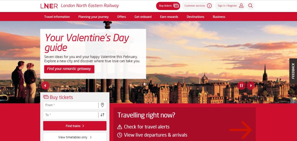
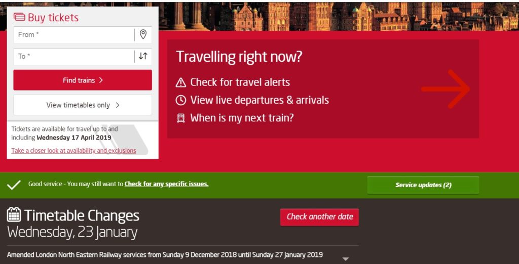
I particularly like the information on travel alerts presented for people who are travelling imminently rather than people booking tickets ahead of time. It shows that LNER have thought about the different types of visitors and their information needs.
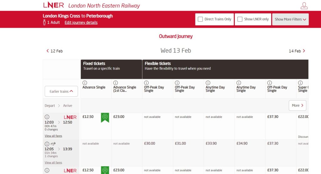
The booking journey itself is clear with helpful information along the way to inform your choices, LNER have managed to take what is sometimes a complicated array of choices and simplify the whole process. There are clear symbols highlighting the best deals – but the site could do with a legend explaining that.
The stand-out moment from this online journey is hidden away under a Check out the seating plan> button… and Pow! You’re hit with a premium online experience you’d expect to find on an airline, another reason we wonder if this is a re-skinned Virgin experience. It’s easy to use and tells the customer exactly what they’re getting.
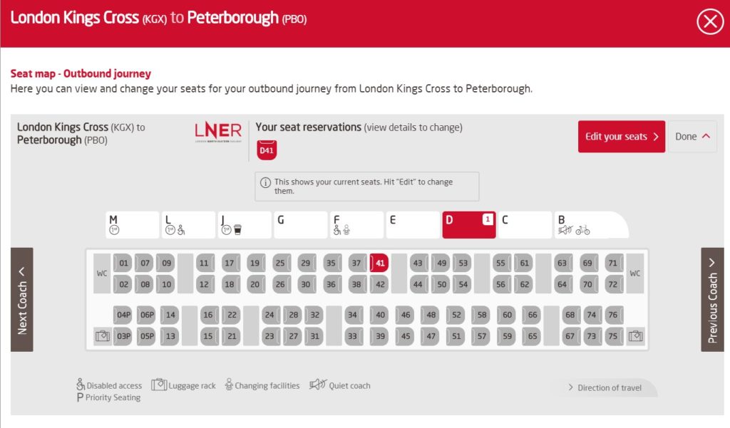
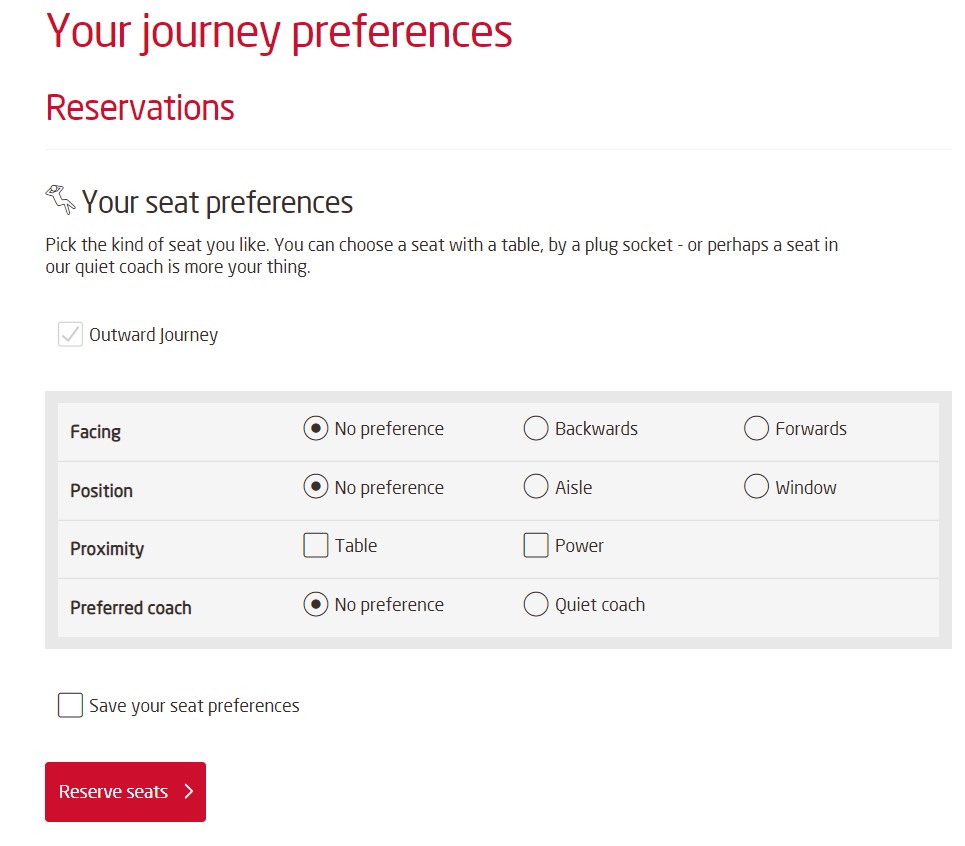
Seat preferences are simple to select and review, including facing forwards or backwards, aisle or window and even whether you’d like to be next to a power socket.
Registration & Sign up
To purchase your tickets online you have to login or register, achieved through a minimalist presentation here with lots of white space. It’s obvious the opt ins have been thought through ensuring when LNER hands the franchise over at some point – the opt-ins can be migrated to the new operator. Consent is also a clear yes or no – no room for ambiguity here.
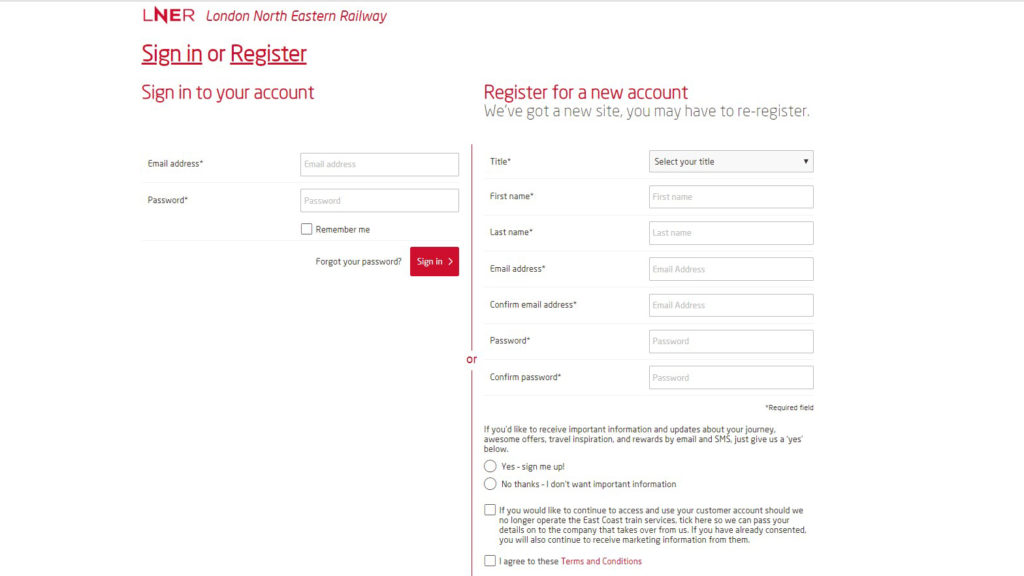
The sign-up also has double opt-in to email, which improves data quality & engagement and also reassures the customer. This process is then followed up with a verification step and finally a registration confirmation email.
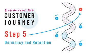
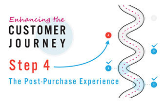
Post Purchase
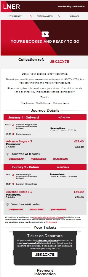
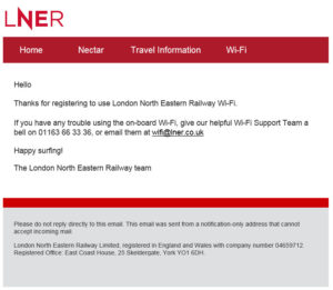
The purchase journey is completed with an email confirmation and uses a well laid out template, again reminiscent of a boarding pass (hence the message “this is not your ticket”). The top section has all the vital information with your collection reference being the most prominent element. The confirmation is split for each leg of the journey and there is information detailing free Wi-Fi codes – one for each passenger.
There is a Your Tickets section reminding you about printing your tickets, although it took me a while to work out what the black shape was representing – a silhouetted paper ticket. This image could be improved with perhaps either a photo of a ticket collection machine or someone holding printed tickets.
There are a couple of other areas that can be improved. Firstly, the sender address does not receive incoming email – and if you are not sure about the reason you should be able to reply to any marketing email, then you can read our best practice guide here.
Secondly, and it looks like an oversight, but the words ‘template ID’ is included in the footer of this email which seems unnecessary.
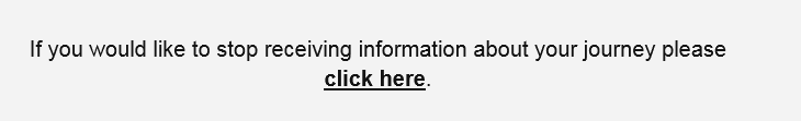
One feature that caught our eye was the ability to unsubscribe from emails for that specific journey. It’s quite a prominent message, and although the normal unsubscribe message is beneath it – it does give customers the useful ability to stop communication for that particular journey but continue to receive news and offers, rather than a blanket ‘opt out’ of everything.
Pre Travel
In all honesty, once I had received the booking confirmation I had assumed that would be that. I was already happy that I had a smooth purchase process and had the essential information delivered, but 6 hours before departure a well-crafted pre-travel email arrived, complete with a reminder of the collection reference, helpful links to things such as Station information and how to find your reserved seat. If I were to nit-pick, it’s missing a customer service telephone number, but that’s a minor point.
This email is excellent, our only quibble is that whilst it reminds you about wifi, it misses a trick by referring you back to the booking confirmation email to get the codes – why not include the codes in that content block?
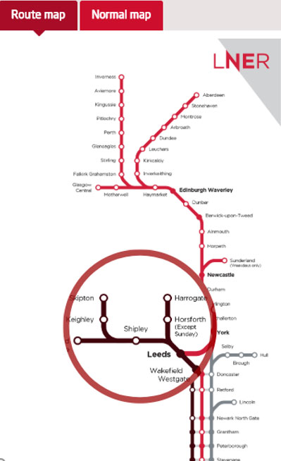
On a similar note, personalisation could be used to shorten the number of clicks to the relevant Station information – instead of landing on a generic page. Whilst we are here though, it’s worth calling out the feature on this website page that has a magnifying glass to use along the route map saving you from clicking it to zoom in and read the stations.
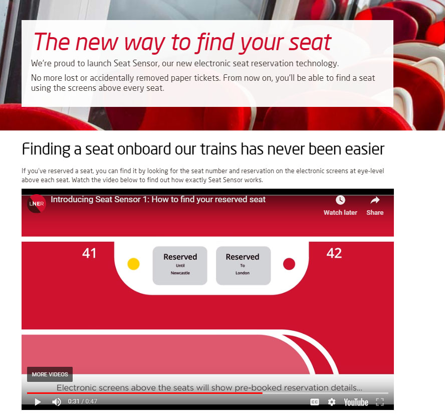
The link for information about finding your seat lands on a video for the new seat reservation system, a slick polished production.
Travel
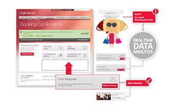
As I settled into my seat and began looking for my email with wi-fi codes, my browser landed on a page apologising for the inconvenience caused by the train delays and giving complimentary access to the wi-fi.
This was promptly followed up by email:
All of us are all too aware of the difficulty in getting systems to join up, and this service-based email is clearly coming from a different partner to the ESP – but it is a shame the same template wasn’t used for a consistent look and feel. It looks cheaper, with a lack of brand identity. A better email may have given the opportunity to promote some of the other on board services or offers.
Post Travel
The last stop on this communication journey is the post travel survey – again a very different look to the earlier emails which have worked hard to deliver a premium feel and the slightly playful tone of voice works well to build character. Not following it through here is a shame.
I did wonder why there is a 5-day window on the survey and why there isn’t a ‘no response’ follow up. There also doesn’t seem to be an incentive here, which will depress response.
Talking of incentives – when I went back to the LNER website, there’s a lot talk around rewards, earning points and loyalty. It’s a shame that none of this came across in the email I received. The post travel communications would be an excellent vehicle to say thank you and to promote added value and the Nectar points.
Final call…
Overall this really is an exemplary example of customer journey programme.
The execution is smooth and the branding and tone of voice are bang on. Each stage of the journey is well served and clearly thought through. Someone has worked hard here and whether it is an internal team, agency team or even people that have left the building when the franchise moved – they should be congratulated. There’s a few things we’ve called out that could be improved, but that doesn’t detract from a job well done.
Would you like R-cubed to map out your customer journey?
Customer journey communications like this do not happen by accident – they require focus, planning and research. Our Customer Journey Mapping exercise and workshop is an excellent way of getting into the details and finding the gaps, what is working and what needs tweaking. Get in touch with us here to find out what a Customer Journey Mapping project from R-cubed can deliver for you.